The 'Y' is divided into blocks representing the differen hierarchy or different aged cell groups, but the cells are close together to form the entire youth division. The green part is the evangelistic outreach sprouting and growing, also symbolising a growing plant. The slogan wordings are in no order to show diversity and creativity among the youths.
The world is ruled by Him and the youth standing beside the world represents the youths. We are able to hold the world in the palm of our hands because He helps us. The sun represents God's love shining down on us. The word 'fusion' is spelt the other way round, because we want to be youths who 'turn the world the other way around' and live for God. The curly hair of the youth represents the complicated life other people live and we want to impact our world. The white t-shirt is to represent Christian youths being pure and holy as living sacrifices for God.
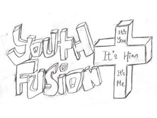
Since we are youth fusion, we should be "BROADCASTING" God and His love everywhere we go, hence the reason for the "SPEAKER". The brand is "Youth Fusion" and its tagline is 'Its you, its me, its Him". The colour purple is used for the significance of royalty. Black is to show the simple notion.
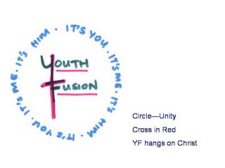
Christ is in the middle of YF and Christ is taking care of YF


Archives
January 2005
March 2005
April 2005
May 2005
June 2005
July 2005
August 2005
September 2005
October 2005
November 2005
December 2005
January 2006
February 2006
March 2006
April 2006
May 2006
June 2006
July 2006
August 2006
September 2006
October 2006
November 2006
December 2006
January 2007
February 2007
March 2007
April 2007
May 2007
June 2007
July 2007
August 2007
October 2007
December 2007
January 2008
Monday, February 20, 2006
©2007 Westside Anglican Church Youth Fusion


